View our “found poem” here.
Our Collaborative Influence Map
As our final collaborative experience for the semester we’re spending our final examination period creating an Influence Map with contributions from all 32 participants in the AUM-OCU partnership.
Each of us selected an image that represents an aspect of who we are and/or where we are from (literally or metaphorically). We will assemble the images into an Influence Map using this Google doc.
Here is our image index for the project. All images are cited on their associated blogs.
We will also finish editing the “found poem” we’ve been cobbling together with AUM. The draft is now in this “Where We’re From” Google doc.
Message from Gym Shorts & Cowboy Boots
She couldn’t make it to OKC so she wrote this nice message to you.
My Line
As our last official intercollegiate blog post this week we’re all choosing a line from our “Where I’m From” poems to be woven into a final collaborative text with AUM. Here’s mine.
I am from Harlem. From ledger and poem and sledge hammer and namaste.
Image source: Kristen Fulara on flickr.com
I Spy . . . Sam’s Map!
Happy Trails, AUM!
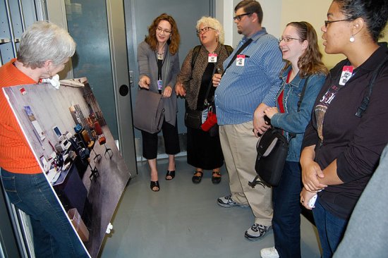
Here’s a peek at our visit to the Memorial Museum archives. I’m looking forward to seeing the photos of the AUM-OCU mapping treks!
Maps as Love Letters
Isn’t this marvelous?
Try to interpret its specific meaning (what is the location of each sweetheart?) then read more about its connection to the timeless challenge of long-distance romance.
Visual Rhetoric as Embodied Cognition
Fun Alternative Mapping Tools
Here are links to the fun alternative mapping tools we discussed toward the end of today’s class:
Influence Map template
We Feel Fine emotional blog mapping
Wordle Word Clouds for wordcentric idea mapping
The Map’s Palette Sets its Tone
This is a very familiar map for our class: the Outdoor Symbolic Memorial grounds at the Oklahoma City National Memorial Center. I am using it partly because I want to acknowledge that my view of this map is much richer today as a result of the visual analyses and observations you all have shared during the past few weeks. I am also using it because at this point in the semester you may be asking, “What else could we possibly say about this map?”
An important component of visual analysis is noticing deeply. (Remember that phrase? It’s one of the Capacities for Imaginative Learning taught at the Lincoln Center Institute for Education and the Arts.) I won’t exhaust your eyeballs with everything there is to see on the above map. Instead, I’ll do the same homework as you: identifying at least one way color is used in the map.
In his color-analysis chapter of How to Lie with Maps, Mark Monmonier explains that most adults are more comfortable viewing maps with a limited palette (168-69) and in muted tones with low saturation, such as grayish blue (170). Mapmakers who want to attract and educate their readers are more likely to use soothing, subtle colors. These techniques are especially relevant for sites such as the OKC National Memorial, which are designed to be places of solace and reflection. The map’s palette is very similar to the natural palette of the Memorial itself because both are intended to be accessible and restful.
The map’s origin on the “Symbolism” page of the official website of the OKC National Memorial suggests that it is intended for first-time visitors to the site. The naturalistic color scheme echoes the photographs on the site, helping visitors visualize their destination and giving them the sense of what they can expect. The heart of the map is the Reflecting Pool. Gradations on either side indicate the land slopes toward the pool, giving visitors a degree of privacy from the surrounding city and some distance from more active (pale yellow) areas of the site, such as the Children’s Area and the Museum. The visual design welcomes visitors to an enclave that is restful but also structured and relatively formal. It sets the tone of respectful remembrance rather than casual tourism.
The tranquility of the palette, however, may be misleading. As Looking 4 Smiles has noted, the site remains an emotionally charged one. The map prepares visitors for a degree of detachment or serenity but their actual experience may be a different sort of mourning.


